
Cheers to two decades of design!
Twenty years go by in the blink of an eye when you’re having fun and bringing ideas to life for inspiring entrepreneurs and successful organizations.
Click through the images to enjoy this trip down memory lane with a few projects from over the years.
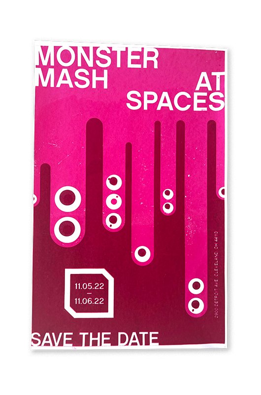
(2022) SPACES - Graphics and medium experimentation suggestive of the organization’s archives were designed for their annual benefit, which brought creativity in monstrous proportions.
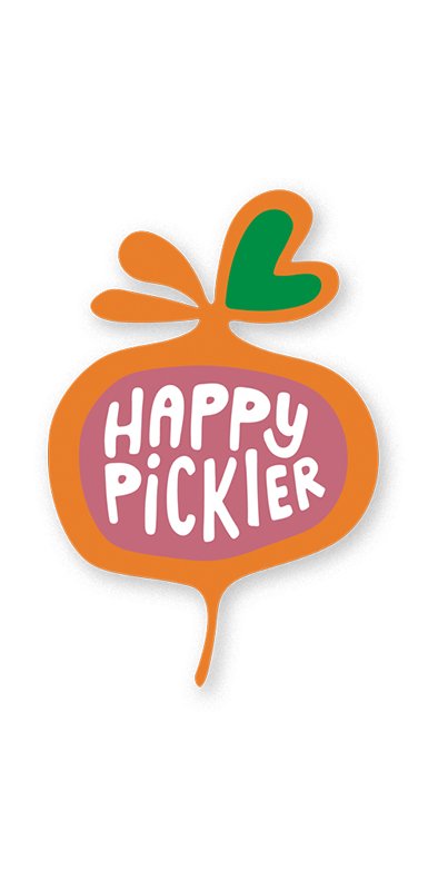
(2022) HAPPY PICKLER - Peace, love, and fermentation. A hand-drawn logo was creaated, which lends itself to the fun-loving brand and developing product line.

(2022) GINGHAM MARKET - Gingham Market’s concept born during the uncertainty of 2020. Fast forward today and the market is bustling with neighborhood activity. Here you’ll find artisan pantry goods and lunch specials as unique as the design itself.

(2022) BLAIR RITCHEY - Blair Ritchey, a stylish entrepreneur, was ready to take her company to the next level. We contributed to a website redesign and revived the existing brand.
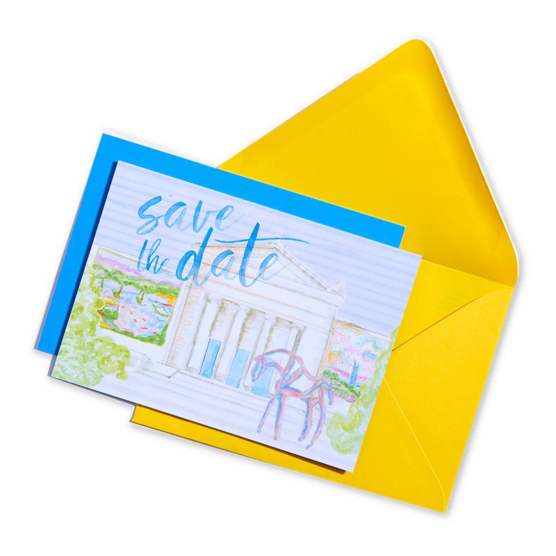
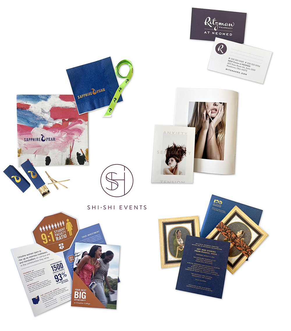
(2022) CLEVELAND MUSEUM OF ART - When presenting artful, world-class experiences to their audiences, the museum chooses their communication pieces carefully. We partner with them to create works that share the wonder and grace of many exhibits.
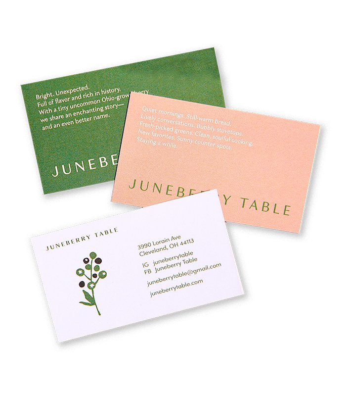
(2022) JUNEBERRY TABLE - A neighborhood spot serving regionally inspired and locally sourced dishes with a side of community. Everything from the brand identity to a custom mural was incorporated into this cozy and intimate space.
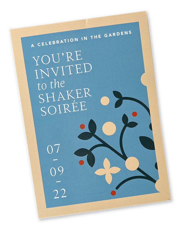
(2022) SHAKER HISTORICAL SOCIETY - A 75th-year celebration brand refresh modernized the organization while remaining true to its roots. A new Shaker "Tree of Life" rich in symbolism & timelessness will carry on the brand story for years to come.
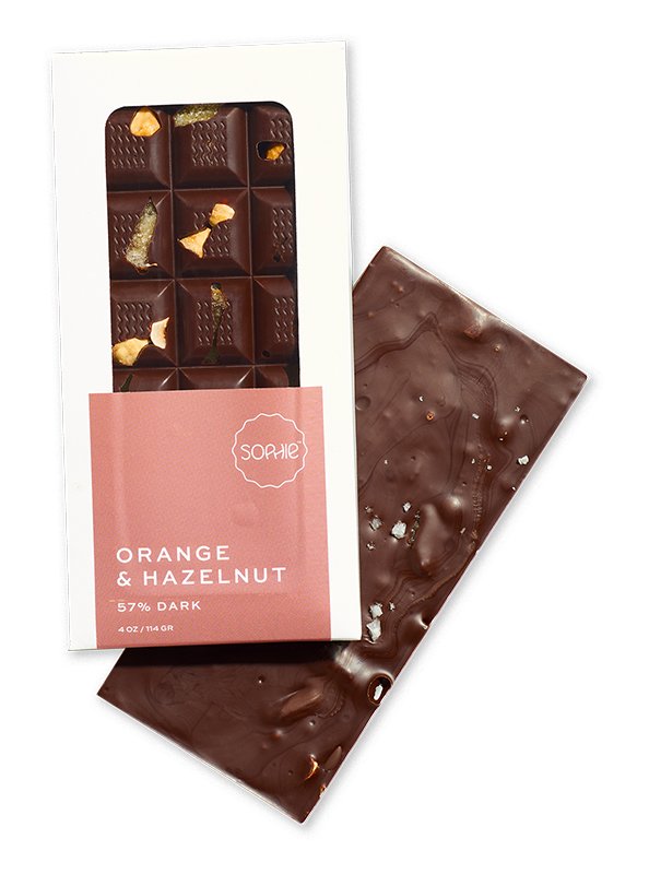
(2022) SOPHIE LA GOURMANDE - A café and patisserie full of classic techniques and modern design require a brand identity as exceptional as they are. French-inspired touches are found in everything from the packaging to custom-styled photography.

(2021) SUNLESS, INC. - From logos to packaging to national campaigns, our studio infused their products and marketing collateral with a sun-kissed glow.

(2021) DESIGN SURFACES - We brought this legacy brand to life through texture, motion, & individualism influenced by this tile and stone company's products and custom design services.
(2021) GREAT LAKES SCIENCE CENTER - Voted top 3 science centers in the country, Great Lakes Science Center’s internal team collaborated with the studio to develop a capital campaign identity, reflective of their out-of-this-world established brand.
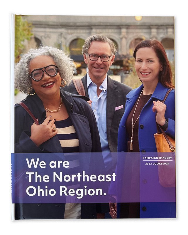
(2021) TEAM NEO - Driving business to the Northeast Ohio Region was the objective. An extensive image library, content templates for the print and digital ads, supporting graphics, apparel, and signage were a few of these robust project deliverables.
(2020) BREAKFORTH STUDIO - Custom branding for the Cleveland-based photography studio & event space, whose goal is to welcome and support the community while bringing individual stories to light.
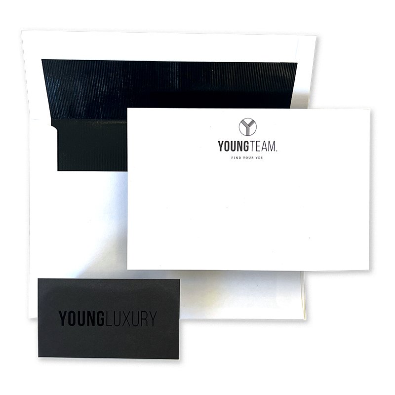
(2020) YOUNG TEAM - The Young Team and its affiliate company, Young Luxury, needed a brand as unique as its approach; with new branding and messaging, there’s just one word to describe our client’s reaction: SOLD!
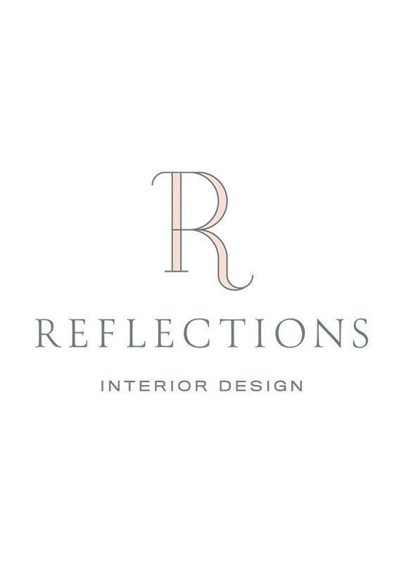
(2020) REFLECTIONS - “Home is where we all hang our hearts and where trusted memories live.” Like the Reflection’s team of talented designers, we put great emphasis on the brand’s details and customization — like the custom monogram.
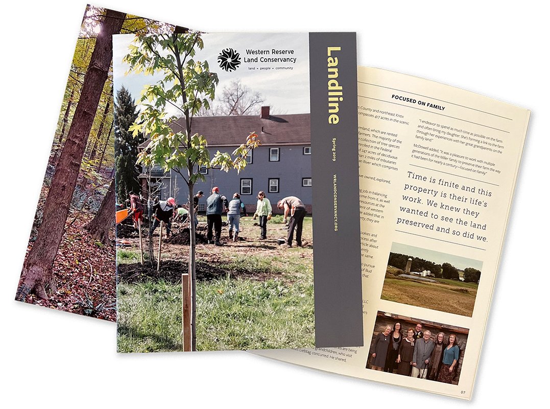
(2019) WESTERN RESERVE LAND CONSERVANCY - A non-profit’s commitment to diversity, equity, and inclusion motivated our studio to deliver marketing pieces that share the story of its mission and vision of land conservation and restoration.
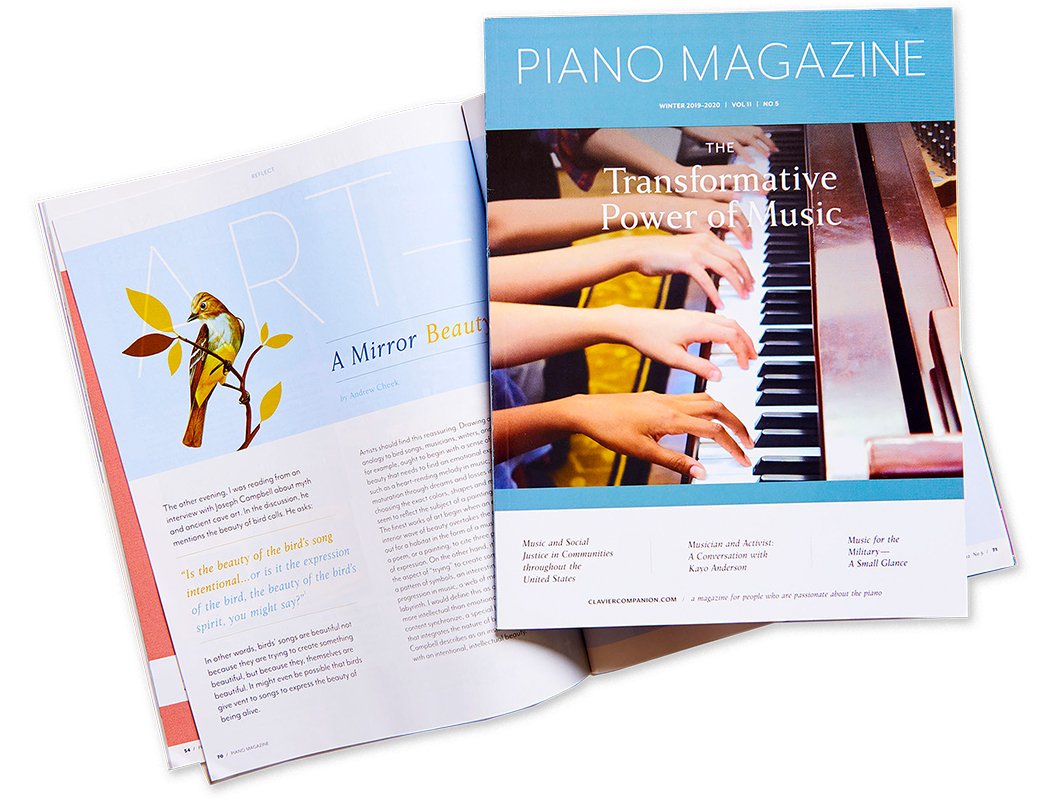
(2019) PIANO MAGAZINE - The publication devoted exclusively to the art of pedagogy was ready for a new look. With thoughtful page design and a consistent brand system, our studio composed an identity met with a round of applause.

(2019) MUSIC SETTLEMENT - To move a 100+-year-old music school toward a vibrant future, our studio energized its overall brand while working with a photographer to create an amazing image library.
(2019) CLEVELAND CLINIC’S GATHERING FOR GOOD - We branded a charity event for pediatric cancer research with a joyful theme and colorful, coordinated components.
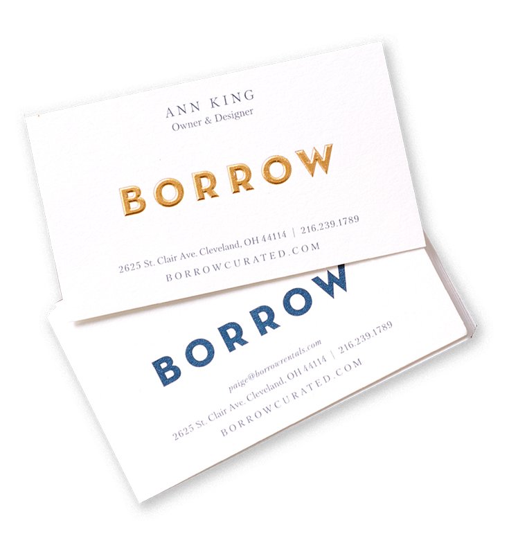
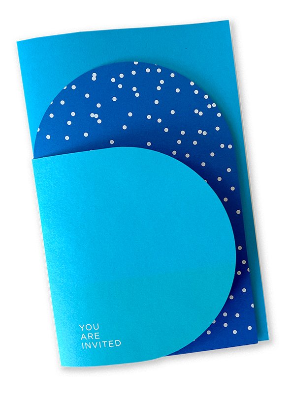
(2019) BORROW - We developed a brand refresh for Borrow true to their background while highlighting their expansion. New additions included a sculpted gold emboss logo and party invitations to celebrate their growing list of clients and collaborators.
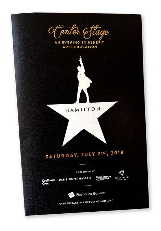
(2019) PLAYHOUSE SQUARE - The country’s largest performing arts center outside of NYC. When it’s their foundation’s name in lights, we design beautiful, functional pieces that garner results.
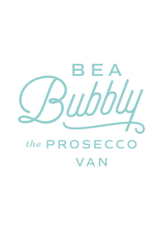
(2019) BEA BUBBLY - Inspired by our client’s time in Europe with her dog, Bea, a charming logo and unique hand painted Piaggio Ape were created to celebrate her passion to serve on-the-go bubbly beverages in the states.
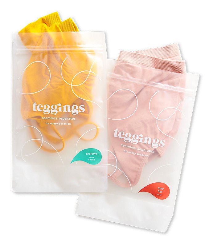
(2019) TEGGINGS - A lively brand inspired and created by ever-evolving forms is supported by a bold color palette and custom playful patterns iconographic of the seamless separates for every body.
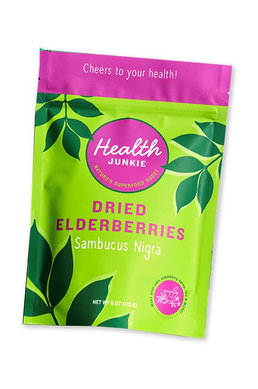
(2018) HEALTH JUNKIE - A go-to, handcrafted wellness elixir was brought to life through a vibrant palette and original illustrations as powerful as the elderberry’s reputation itself. Here’s to your health!

(2017) PALADAR - Rum 101. Chock full of information, enticing imagery, and drink suggestions, this “rum-bible” handbook is designed with their sweet flavors for a spicy life. Cheers!
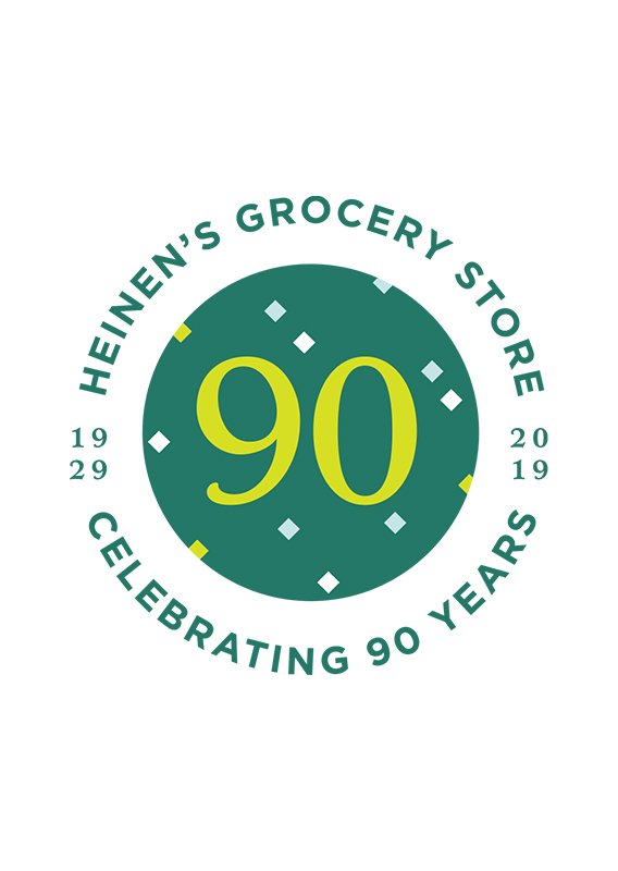
(2017) HEINEN’S - Honoring their 90 years of service to the community, we created an identity inspired by their past and future. Recognizable shapes paired with new energetic colors brought this party to life!

(2017) NATURE CENTER AT SHAKER LAKES - We design materials to represent the beauty, adventure, and discovery that define this free green space; this polished new look maintains a nod to history’s past while bringing a breath of fresh air.
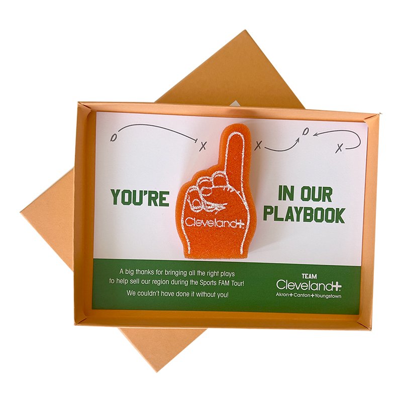
(2016) CLEVELAND PLUS - Want to invite a handful of the country’s most sought-after site selectors for a weekend of football and Hall of Fame fun? Send them mini foam finger invites and your guest list will be full.
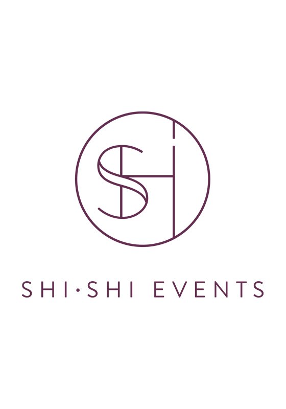
(2016) SHI SHI - A boutique wedding planning company established on creativity and luxury required an authentic identity. This includes a stylistic monogram as recognizable as the experiences the company creates.
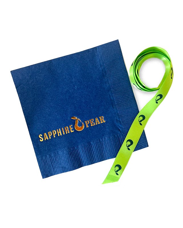
(2015) SAPPHIRE PEAR - Their new look needed to live up to its 40+ years of interior design experience. Fun-loving, stylish, and bright, we brought individuality to the brand just like they bring customized designs to their clients.
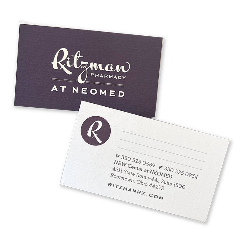
(2015) RITZMAN PHARMACY - This family-owned pharmacy craved a modern apothecary appearance reminiscent of its 70+ years of service. We developed imagery, packaging, promotional campaigns, and more to ensure a healthy future for the company & its patients alike.

(2015) CASEY REARICK - Photographer Casey Rearick specializes in lifestyle and portraiture imagery. We were invited to collaborate on a promotional lookbook, which we knew needed to be as lively as his presence and the visual stories he tells.
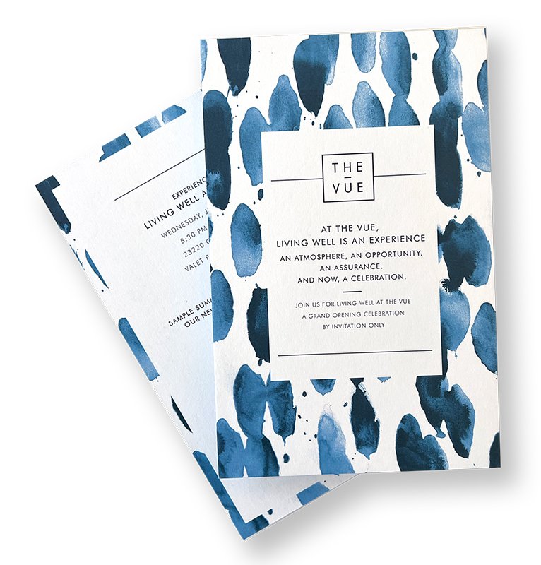
(2015) HELLO | THE VUE - Collaborating with Hello LLC for the opening of their client’s luxury multi-family apartment building, our team brought the vision of creativity, playfulness, and lots of sophistication through the event invites and materials.
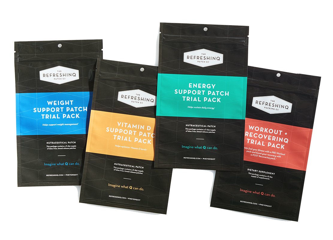
(2015) REFRESHINQ - For a supplement start-up focused on helping individuals achieve balanced lives, we fortified their product packaging with fresh ideas, setting RefreshinQ on an artful path to inner (and outer) happiness.
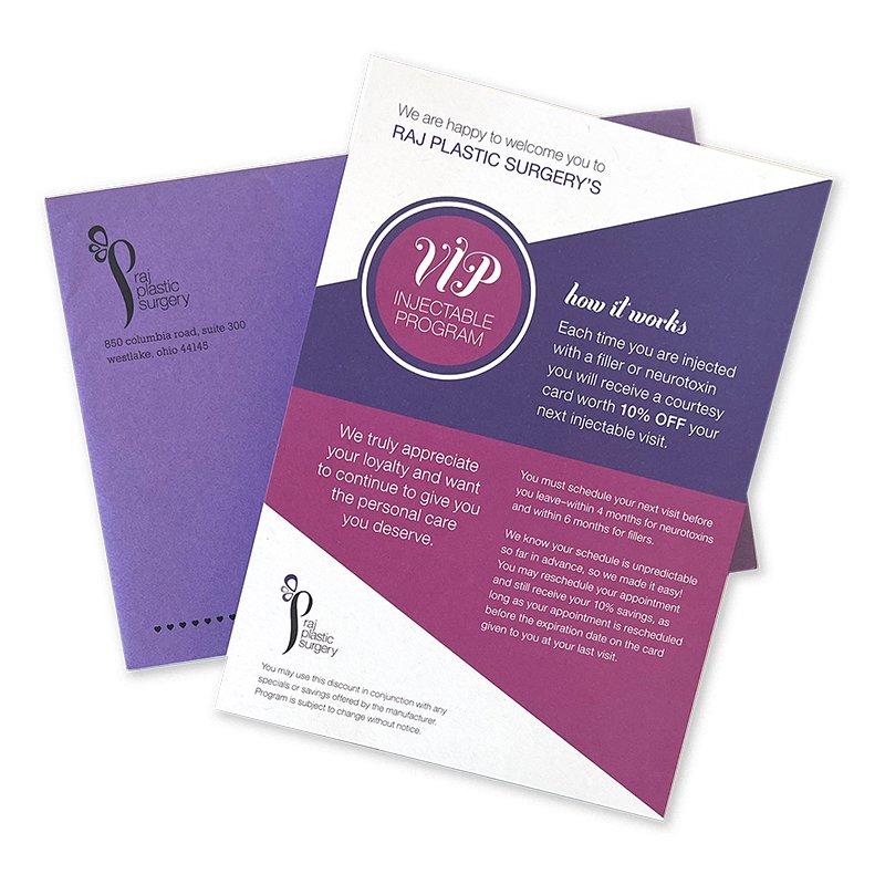
(2014) RAJ PLASTIC SURGERY - Looking to make big changes though bold design tweaks, our firm collaborated with this practice to enhance their visual campaigns around town both in print and digital mediums.
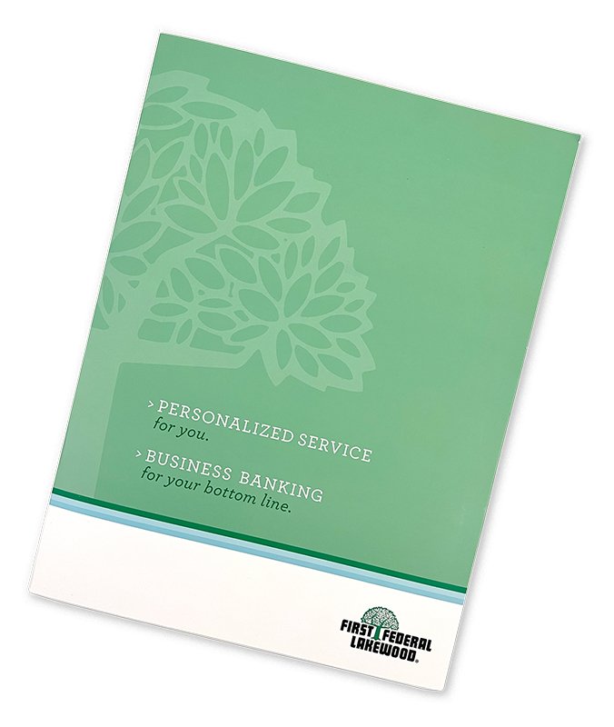
(2014) FIRST FEDERAL LAKEWOOD - This strong community bank was seeking a fresh visual approach to its banking materials. As their target audience and designers, we created collateral while using a diverse set of images to reflect the business community.
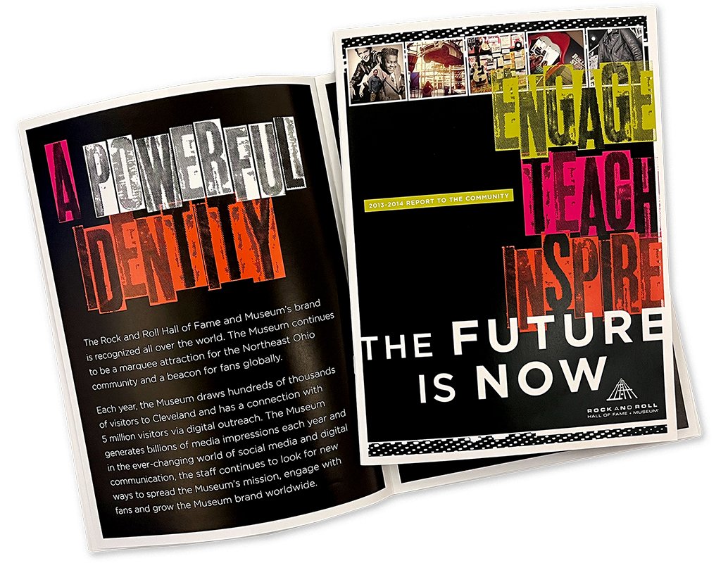
(2014) THE ROCK & ROLL HALL OF FAME - This annual report exudes rock and roll—a little bit of grunge with a lot of grit. Our team designed this piece to showcase the successes of this global music destination.

(2013) URSULINE COLLEGE - This series of pop-up direct mailers were sent to interested students who engaged with enrollment online. These bold and bright open house invitations garnered many on-campus visits and were considered a successful marketing initiative.
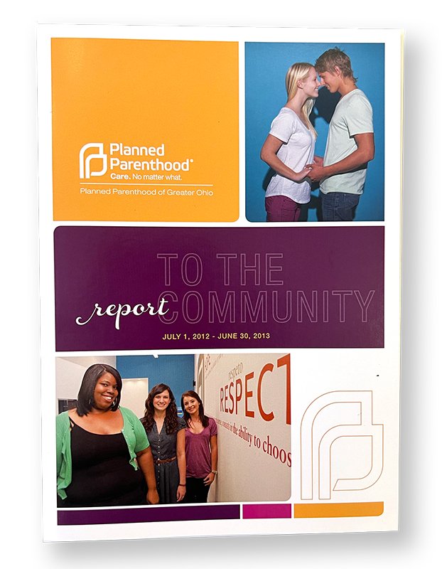
(2013) PLANNED PARENTHOOD - We designed a series of course catalogs and collateral to highlight the good doings of their Northeast Ohio location, and this often misunderstood organization.

(2013) MOEN - The thoughtful, innovative design earned Moen the #1 faucet brand title in America—that same approach earned us a 15+ year collaboration and multiple opportunities to package and present their products.
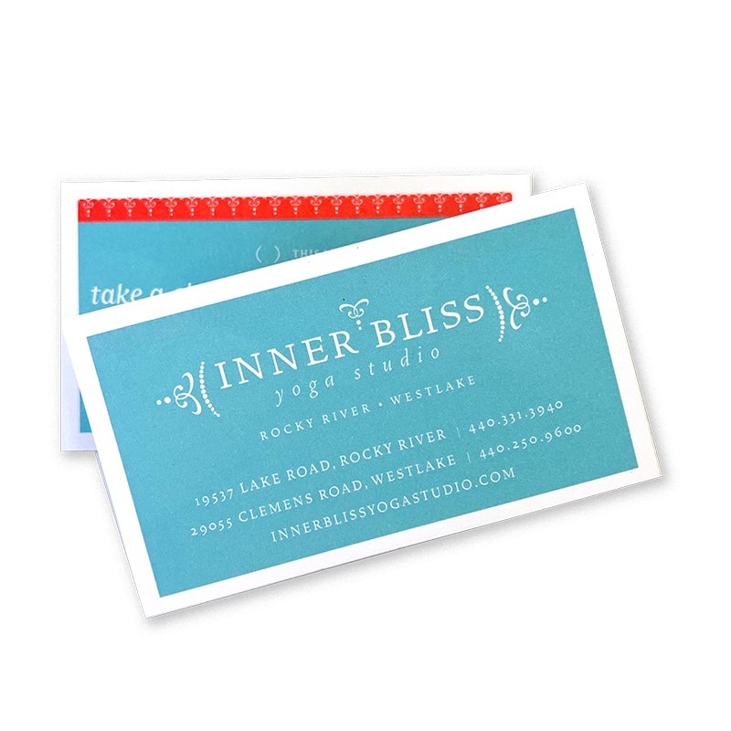
(2012) INNER BLISS - Our studio collaborated with their team to develop the intricate and organic brand systems still at work today. Good design is a series of choices and great decisions paired with lots of planning. Om.

(2011) FAIRMOUNT PROPERTIES | THE FLATS - Seeking tenants for their rising (re)development of the Flats, Fairmont Properties engaged with us to produce a lookbook for the lifestyle destination. Look close enough and you might spot some “friends of the studio!”

(2009) HINKLEY LIGHTING - Creating for Hinkley Lighting has included designing 400+ item catalogs to styling photography. “Life Aglow” is much more than a tagline we developed for the brand, it’s a summer of our radiant multi-year collaboration.
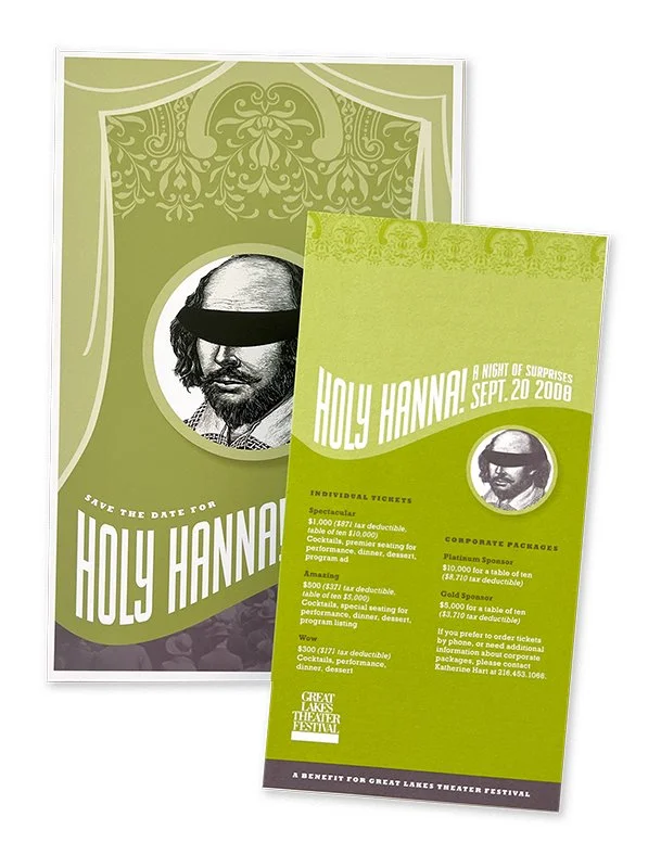
(2008) GREAT LAKES THEATRE CO. - When the redesigned Hannah Theatre was about to unveil its new interiors, the committee called for a one-of-a-kind party invitation. Nothing beats a Shakespearian-looking invite to engage curious guests and a sold-out opening night!
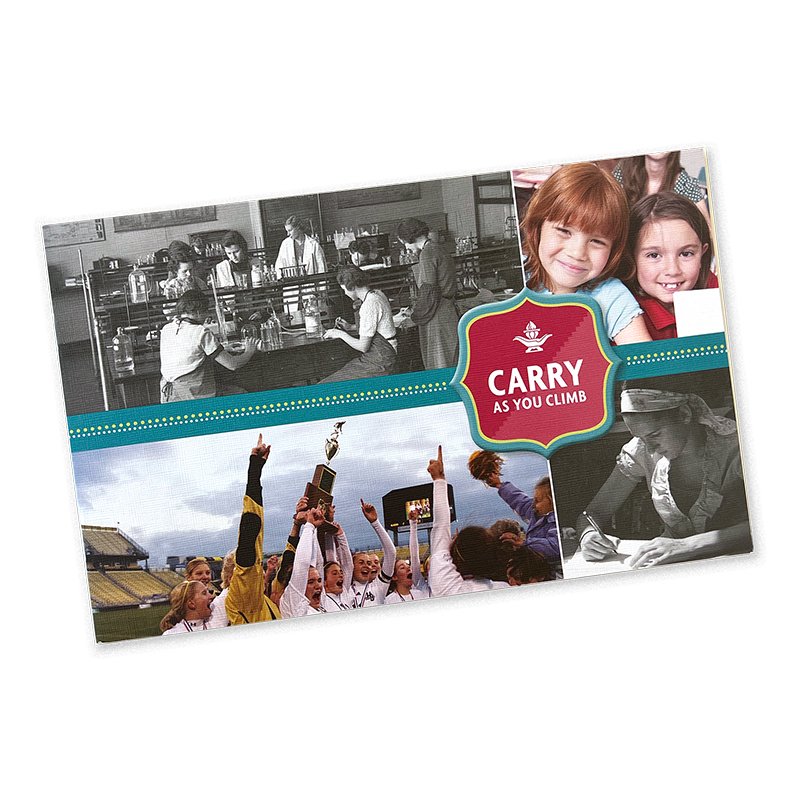
(2008) HATHAWAY BROWN - As we developed the “Carry as you Climb” campaign materials, we were also introduced to various other departments through the school, allowing us to have some creative fun.

(2006) FLYING FIG - Flying Fig was one of the first successful farm-to-table concepts in Cleveland. A recognizable illustration was paired with appealing print treatments as enjoyable as this staple’s menu.

(2006) TOWARDS EMPLOYMENT - From annual reports, mailing, employee training manuals, and more, we helped the organization connect individuals to careers and the community.
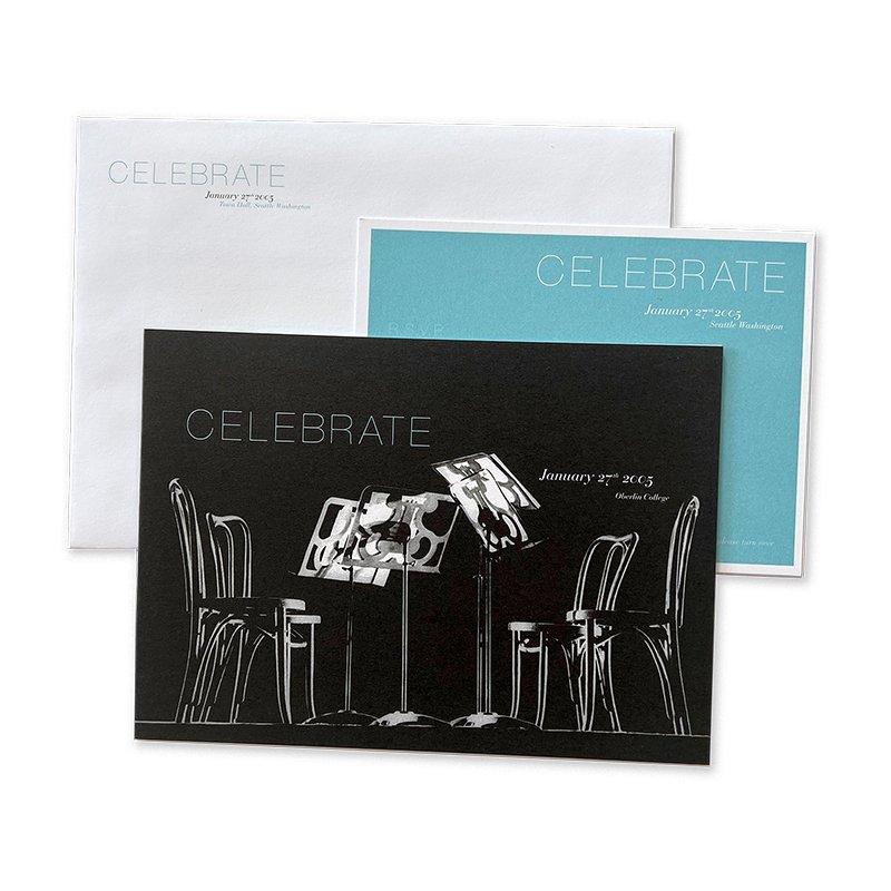
(2005) OBERLIN COLLEGE - The private liberal arts college and music conservatory was looking to showcase their music programs. We designed a series of mailings to students, donors, and faculty to encourage attendance at the event series. Voila!
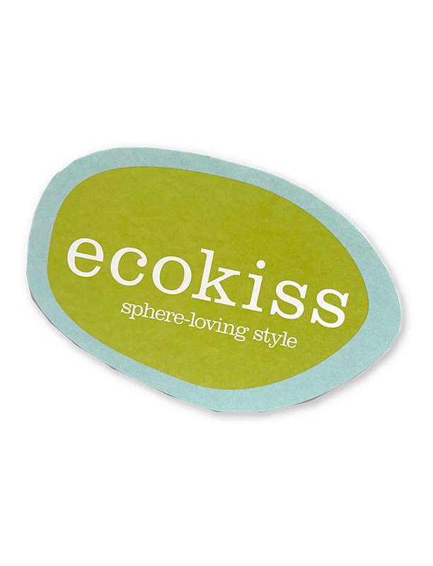
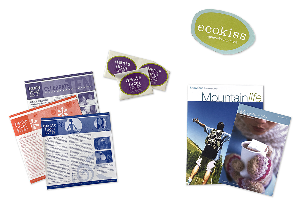
(2005) ECOKISS - A visual identity was created for this organic gifting destination located within the walls of Mustard Seed Market. This little boutique made shopping good for the environment and accessible to all.
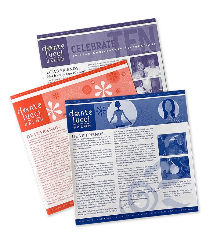
(2004) DANTE LUCCI - Collaborating with their stylists on newsletters, gift cards, promotional mailers and more, were a highlight of our studio. Their chic illustrations of stylish ladies brought joy to our work and our design team.
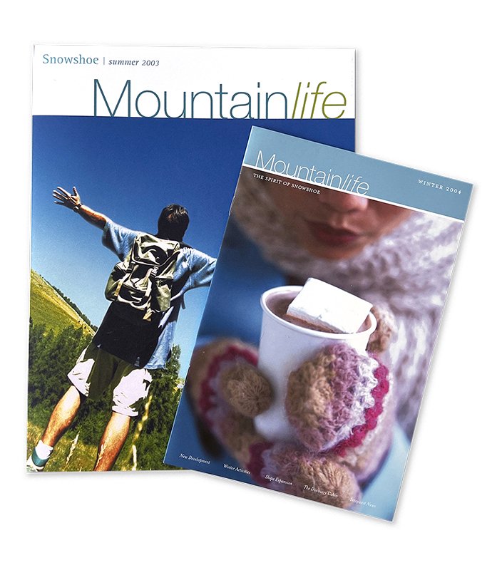
(2003) SNOWSHOE MOUNTAIN - Located in Snowshoe, WV, this destination wanted to refine its communication efforts with its homeowners and ski bunnies alike. Developing seasonal print collateral, apparel, and even hot cocoa mailers, this was our first out-of-town client.